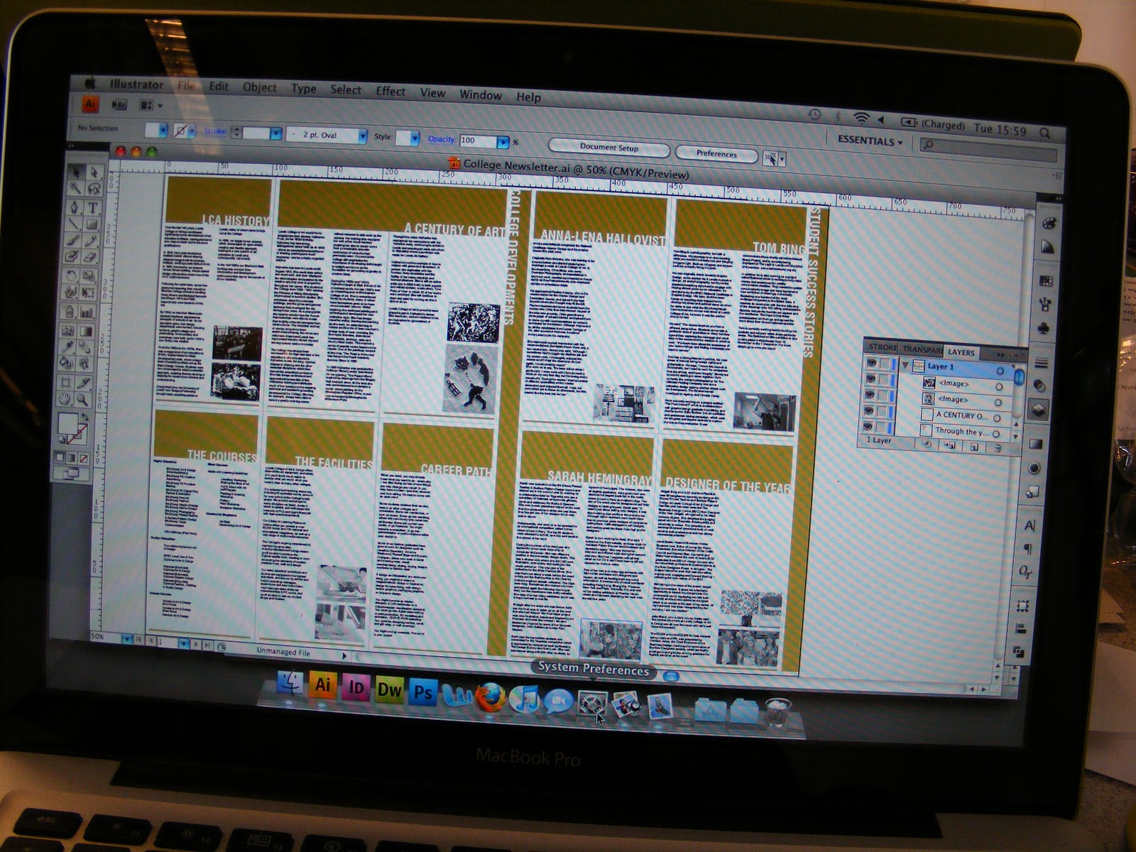
Newsletter back
The time has come to tackle the back of the newsletter. The idea from the very beginning was to have the back of the newsletter be a poster so that people would keep it and put it up rather than read the newsletter once and then put it down or throw it away. Something aesthetically pleasing is way more likely to be kept.
I definitely wanted to use a photograph for the bag of the poster and I have no good images of around the university at the moment so I pulled a stock image of the view from the university out over Leeds from google just to have a play with. I used this image while I was still using the gold of the original newsletter design. Ignoring the dark stripe at the top of the page, that was me being an idiot and trying to match colours and failing spectacularly. Anyway. I just changed the image to a monotone using that one gold colour and in truth, it looks fairly vile and I can see why people think that it's a horrible colour. In small quantities, it's nice, but like this it's majorly overkill. The photograph just covering the whole A2 space looked ridiculous too. There is no white space whatsoever and it looks like it hasn't been thought about at all so this idea is going straight into the bin.
Another vexing point. The logo for the Leeds College of Art that we were given to use for this design is the most rubbish quality and awkward thing to work with ever. You have to go about 7 layers deep before you can even change the colour of the text and it's just far more complicated than it has to be.

I found this image of the front of the uni on the website and while it's only very small and low resolution, it'll be fine simply for a proposal, which is all my newsletter is.
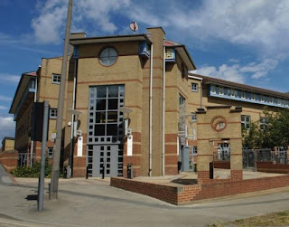
I used the purple and the gold of the design of my newsletter this time. While I decided that using a full page photograph really wasn't work, I decided to utilize the white space of the back of the newsletter and used the photograph in a circular shape and changed it to a monotone of the purple spot colour. This worked much better in the way that the newsletter folded down. The circle photograph can't even be seen once it's been folded down, and the text at the top of the poster makes up the front and the back covers of the newsletter whilst in it's folded state. I just need to get this printed in the digital dungeon and then I can get some product shots of it.

I definitely wanted to use a photograph for the bag of the poster and I have no good images of around the university at the moment so I pulled a stock image of the view from the university out over Leeds from google just to have a play with. I used this image while I was still using the gold of the original newsletter design. Ignoring the dark stripe at the top of the page, that was me being an idiot and trying to match colours and failing spectacularly. Anyway. I just changed the image to a monotone using that one gold colour and in truth, it looks fairly vile and I can see why people think that it's a horrible colour. In small quantities, it's nice, but like this it's majorly overkill. The photograph just covering the whole A2 space looked ridiculous too. There is no white space whatsoever and it looks like it hasn't been thought about at all so this idea is going straight into the bin.
Another vexing point. The logo for the Leeds College of Art that we were given to use for this design is the most rubbish quality and awkward thing to work with ever. You have to go about 7 layers deep before you can even change the colour of the text and it's just far more complicated than it has to be.

I found this image of the front of the uni on the website and while it's only very small and low resolution, it'll be fine simply for a proposal, which is all my newsletter is.

I used the purple and the gold of the design of my newsletter this time. While I decided that using a full page photograph really wasn't work, I decided to utilize the white space of the back of the newsletter and used the photograph in a circular shape and changed it to a monotone of the purple spot colour. This worked much better in the way that the newsletter folded down. The circle photograph can't even be seen once it's been folded down, and the text at the top of the poster makes up the front and the back covers of the newsletter whilst in it's folded state. I just need to get this printed in the digital dungeon and then I can get some product shots of it.

Posted in Labels: design team, newsletter | Edit | 1 comments