Showing posts with label butterbeer. Show all posts

Monday, 8 November 2010

Popcorn box

Posted on/at 16:13 by Hannah Jackson


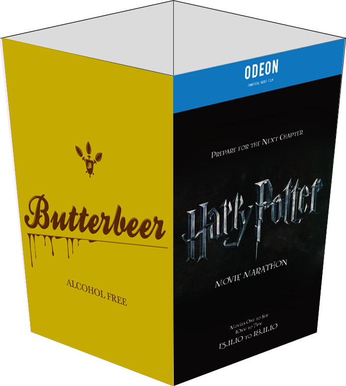
So a recent trip to the cinema reminded me of the fact that the popcorn boxes are used as promotional material as well so I made a little mock up of a popcorn box to apply the images too. Whenever there is a massively popular film out at the cinema, it's that which takes over the imagery of the popcorn box so here goes. I used a mixture of the imagery that I've created so far, including photographs, logos, promotional stuff etc, and have gone through a fair few layouts to find something that works.


Although the imagery for the promotional material so far as been using the dark/silver Harry Potter logo, I tried out the old gold logo on the boxes and have some to the decision that it works really well when combined with the logo for the drink. The photographs of the product really weren't working on the box but I did like the idea of having the logo on there as an advertisement for the product.

As the bottom image portrays, I tried to put both of the different coloured logos together on the sides of the box but it didn't really work and seemed a little like overkill. Another point is that if the box has both logos on it, you would be advertising alcohol to kids because the same box would go to everybody. If the boxes are separate there is the issue of the only selling the one advertising the alcoholic version later and even then kids go to all showings these days sooo...I am proposing that the only advert that goes on the popcorn box is the one for the non alcoholic version. Which is the box directly below this text.


More Butterbeer Context

Posted on/at 14:59 by Hannah Jackson

I got a photograph, kinda low res, but it was the best that I could pull from google images. It's actually a photograph of a Vue cinema foyer but I shopped in some Odeon logos just for the time being. It was quite easy to apply my Butterbeer photographs and logos into the screens that normally house the menus. I showed this to a few people around the studio and got the feedback that it actually looks like it's there so, manip done well, I believe.

Using the photographs that I took of the bottles I mocked up some promotional images for the inside of the foyer. The two images below are the same photograph flipped just to see both of the bottles on these banners. I think that the large images work quite well and definitely attract attention.


Just another billboard mock up on a large billboard outside of one of the main Odeon cinemas.

Sunday, 7 November 2010

More Product Shots

Posted on/at 23:28 by Hannah Jackson

So I accidentally managed to leave my camera locked in a college like a right spanner so I ran downstairs and borrowed my housemate's SLR, which is brilliant! But then, I suppose it really should be for a £500 camera, hm? Anyway, I set up a little studio in my bedroom so that I could take some more shots of my butterbeer, finally using the tankard that I bought.

I bought the tankard with the intention of engraving the butterbeer logo into the glass but apparently due to the shape of it, it's mostly concaved, it is really difficult to do because you can't get a sticker to lie flat on it in order to create a stencil. So I'm going to have to just photoshop it on and propose the idea of it.

Anyway, the pictures turned out really well considering that I took them in my bedroom on a sheet of paper, these are the best ones that I managed to take. The head of the drink kept disappearing while I was taking the pictures so I kept having to stir it up with a spoon to get the head back as best I could.


HP: Adverts

Posted on/at 18:15 by Hannah Jackson

The poster that I made in the previous post and applying it to a range of media including bus stops, bill boards etc. The bus stops were the easiest to do because of the format of the poster I originally designed. Just import it into photoshop, free transform it and move it into the space on the picture. At the moment I'm just using images from Google for the moment, the highest res that I can find, but ideally I would like to take my own images of bus stops and apply my posters to them, but I haven't had much time to really go out taking such images. Been glued to my mac like nobody's business.


The billboards also weren't difficult to do, they have a similar format to the posters, just stretched out a little bit. Well obviously I didn't stretch my design, that would be ridiculous, but I just made the back wider and rejigged and resized everything to fit. I think they they work quite well and I could definitely see them as a bill board. Since I don't have a car and don't get to travel in one all that often these days, I don't see many billboards so I haven't really seen any recent examples of them.


The tube poster was a little bit harder to do, really, as you can see I didn't get it quite right. It's such a simple thing but apparently quite difficult to mock up and apparently I haven't quite mastered the art of warping in Photoshop just yet.


Also on the side of a bus as well as in Photoshop, this is a way of creating a portable advertisement so I figured that bus side posters were the way to go. It was a much different format to the posters and billboards so I had to rejig the layout completely but I think that it works alright.

Saturday, 6 November 2010

Promotional Materials for the Marathon

Posted on/at 21:48 by Hannah Jackson

Okay so, during my tutorial with Joe I told him that I was struggling to find a context for my drinks. He suggested something, well, brilliant, and I was kicking myself for not thinking of it. Each drink is from a novel that's been made into a film at least once. So, events at the cinema, using the drinks as limited edition things for the one night only. It's pretty perfect and that's the route that I started going down. I did a load of design sheets for this but again, I work quicker and get more ideas and variations out of the way by working on Illustrator so I got on with it. I found a couple of Harry Potter fonts on dafont and the like so I got those and started working. They're not brilliant, but they'll do.

I also took the Harry Potter logos from google and live traced them using limited colours so that the texture would appear, but it wouldn't be a ridiculous amount of paths. Then it can easily be rescaled and recoloured to whatever I need it to be.

I also had a bit of a play with phrases from the book/film, focusing mainly on 'You're a Wizard, Harry' because that's one of the things that I remember most clearly from all the books/films.

I also had a bit of a play using very simple imagery, such as the Lightning bolt, but I don't think it's iconic enough for people to see it and instantly think Harry Potter. To me, I look at it and think Flash Gordon. Wrong thing entirely. I tried putting images of the actual product on the poster with the text and I dont think that this works. I think that I need something that iconically says Harry Potter to draw people to the event and keep the product as something as something that will appear in the cinema itself. Part of the menu or something.


After much playing around and many layout options. I vectored the HP logo from the last film, very silvery and nightish and dark. This one is nowadays far more recognisable than the original gold one. I suppose it shoes how the storyline is getting darker and darker as it goes along. Anyway, I vectored it and used a font called Lumos, which is based on the fonts used for the chapter title pages in the books, to write very simple things. This is a poster that I intend to be on bus stops and such, so when considering the hierarchy I think I only need to say what it is, where it is and when it is. There is no need for any more information than that on something that people are only going to give a couple of seconds of their time to.


I made two options of this, using the dark black and silver more modern logo and and the gold of the early branding. Out of the two, I much prefer the dark one as the light coloured one looks far too...childish? Yeah, it looks like the promotion for a children's film, which I don't think that Harry Potter is now? Yeah, we were kids when we started watching it, but mostly we've grown up with it. At the same time as being more grown up, it represent the branding for the next coming film, and this marathon serves as a build up to the release of the new one, which is good. I also chose the Odeon as my cinema of choice so I added the Odeon logo as a banner across the top of each poster. Rather than saying 'at the Odeon' the addition of the logo simplifies the poster even more and represents it as an Odeon event.

Friday, 5 November 2010

Butterbeer Product Shots

Posted on/at 15:53 by Hannah Jackson

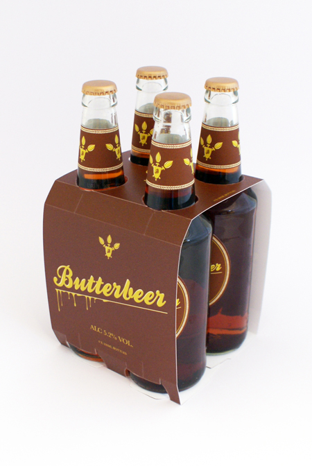
I don't think anything more needs to be said than that these are the product shots of the final designs for my Butterbeer brief. The designs printed out so much better now that I have chosen spot colours and the new colour for the alcohol free packaging works much better and stands out from the alcoholic version as a seperate product in the range rather than being too similar, which it what it was before. It is also much more eye catching and while they stand out from each other, the two products work well as a set.