
Popcorn box

So a recent trip to the cinema reminded me of the fact that the popcorn boxes are used as promotional material as well so I made a little mock up of a popcorn box to apply the images too. Whenever there is a massively popular film out at the cinema, it's that which takes over the imagery of the popcorn box so here goes. I used a mixture of the imagery that I've created so far, including photographs, logos, promotional stuff etc, and have gone through a fair few layouts to find something that works.


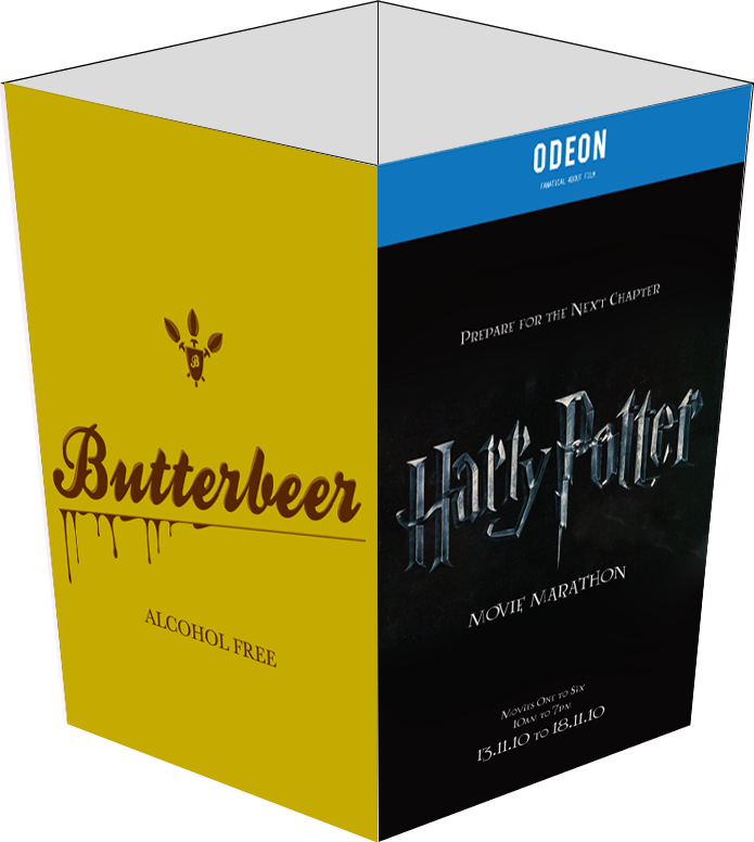
Although the imagery for the promotional material so far as been using the dark/silver Harry Potter logo, I tried out the old gold logo on the boxes and have some to the decision that it works really well when combined with the logo for the drink. The photographs of the product really weren't working on the box but I did like the idea of having the logo on there as an advertisement for the product.
As the bottom image portrays, I tried to put both of the different coloured logos together on the sides of the box but it didn't really work and seemed a little like overkill. Another point is that if the box has both logos on it, you would be advertising alcohol to kids because the same box would go to everybody. If the boxes are separate there is the issue of the only selling the one advertising the alcoholic version later and even then kids go to all showings these days sooo...I am proposing that the only advert that goes on the popcorn box is the one for the non alcoholic version. Which is the box directly below this text.


Posted in Labels: butterbeer, Fictional Drinks, ougd301 | Edit |
0 comments:
Post a Comment