
Fizzy Lifting Drink Dev
As I've done before, I feel that I can get more development and ideas down while working on Illustrator than I can on paper so I started working on the document. Again, I just used one large document and filled the art board rather than working in separate documents. I suppose it keeps everything in one place. Anyway.
I started out by doing a few typeface tests to see if there were any that I think would work and could experiment with a little bit. I tried using a couple of light weight sans serif typefaces, to give the impression that they could simply float away at any given moment. I also played around with Clarendon, trying to warp the text and such, trying to make it look a little like a bubble and failing spectacularly. I also pulled a few fonts off dafont that were a little more childish and fun looking because when all is said and done, the target audience for this is children. If not my target audience, then the Wonka products in the book and real life are all aimed at kids.

I went on 'kuler' and to see if anything came up when I typed the word 'wonka' into the search engine. I got a few hits but the two colour palettes on the design sheet below were the two that stood out the most. The colour that springs to mind when I think of Wonka is purple. It's also the colour that people associate with Cadbury chocolate, but it just comes to mind when I think of Wonka too. Other people must thing so too because both colour palettes heavily feature purple.
I had a bit of a play with the idea of bubbles being a part of the text. Not all of the words how a round shape in them so I settled for playing with the dots of the 'i's in each and making them into bubbles. Here I'm pretty much just playing with the wonka purple and golden ticket gold colours together. They're fairly contrasting colours but at the same time, they work quite well together because they make each other stand out quite nicely.

Scrapping the gold and just playing with the purple now, against white and shades of the purple and such. I've kind of scrapped the idea of using Clarendon now and have turned my attention to the more child-like typefaces that I pulled off of dafont. The one I'm using on the below design sheet really reminds me of the old TV show 'Bewitched'. Anyway, it seems like a pretty fun and lightweight looking font without being too serious. Wonka products are never serious.

These are the same bottle shapes that I used for my Butterbeer bottles, just to see hwo I could possibly lay things out on the bottle shapes. In truth I prefer the circular images on the bottles to the square ones, though I don't think that this bottle shape is really working. It's not what I had in mind at all and it simply doesn't sit right with me. It seems far too generic and boring for a Wonka product.
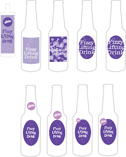
This is a bottle shape that I much prefer, while probably more difficult to source, I think that it seems far more interesting and fun, in a way. it's more aesthetically pleasing and eye catching because of it's unusual shape. I'm still playing around with the bright Wonka colours, in particular I'm focusing on the purple as it's the colour that I most identify with Wonka. It's quite a fun colour as well as having the connotations of high quality.
Like with the Pan Galactic Gargle Blaster, I quite like the idea of playing with a back label that would show through the liquid rather than have a fancy front label. it makes the design more interesting and more thought out. I'm also playing with the idea of having a ribbon and a wax seal sort of effect to get the Wonka logo on there, though this brings it up and away from the kids drink that I intended it to be, and makes it look far too expensive and high quality.

Posted in Labels: Fictional Drinks, fizzy lifting drink, ougd301 | Edit |
0 comments:
Post a Comment