
Design Team: Newsletter
After the design sheets for this newsletter, I pretty much just stopped drawing and started playing with folding techniques for it instead. For as creative as we all are, I figured that at the end of the day, it's still the marketing team that is going to be choosing this, so I figured I would keep the design a little more corporate than not. So in light of this, I wanted to make the folding technique a little bit more interesting. My main idea for this is a sort of staggered concertina fold.
This one was just a sheet of A3 paper folded down into an A5 square. The size that I'm going for with this newsletter is A2, but I didn't really have any to hand. I just wanted to see the rough size that it was folded down, as this is something that needs to be mailable and easy to handle.

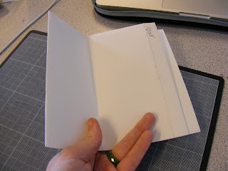
This was folded in half length ways and then folded into a staggered concertina. The result felt quite thing and had a tendency to keep springing open so it didn't fold down quite so well. Obviously, this is cartridge paper and it's quite thick so therein may lie the error of these mock ups, but hey.


Pop open! oh no!
The fold below I much prefer, I folded it into a staggered concertina first and then folded it in half. This way it folds down much better and doesn't spring open. The benefit of this too is that there are no staggered edges on the outside for anything to catch on, if that makes sense. It will slide into an envelope much better.


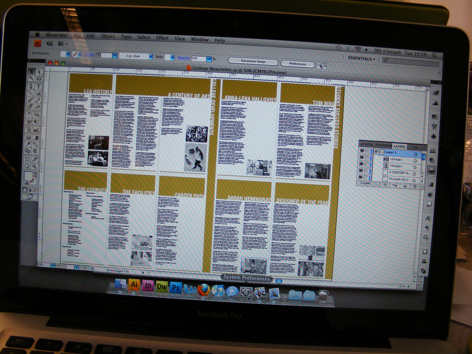
The design on screen. I decided to go with the gold that was used on the college prospectuses and promotional material this year (Designed by this is workshop, former students). It looked quite nice on screen. The brief specified that it wanted limited colours, so I went with one colour (gold) + black + stock. I pulled all of the content off the college website rather than used Lorem Ipsum. I dropped all the images in and converted them to grayscale. This is the first time that I've really designed anything like this and I'm quite pleased with how it turned out. So far anyway. Now I have to worry about the back of the newsletter, which I want to be a poster of some description with the open days listed.

I printed this out at A3 on the laser printer, so it's pretty bad quality but in truth I merely wanted to test that it folded down okay and that my layout worked. It did! Hurrah! It lined up just right, which is a first for me to get it right first time. The laser printer made a complete hash up of the colour as well and it was pointed out in the crit that it wasn't the nicest colour in the world anyway and that I should have a bit of a think about it. The fold technique went down really well in the crit and people seemed to approve.


Held up by the lovely Becca. Obviously, it would be printed at A2, and this is just a tester.

This one was just a sheet of A3 paper folded down into an A5 square. The size that I'm going for with this newsletter is A2, but I didn't really have any to hand. I just wanted to see the rough size that it was folded down, as this is something that needs to be mailable and easy to handle.

This was folded in half length ways and then folded into a staggered concertina. The result felt quite thing and had a tendency to keep springing open so it didn't fold down quite so well. Obviously, this is cartridge paper and it's quite thick so therein may lie the error of these mock ups, but hey.


Pop open! oh no!
The fold below I much prefer, I folded it into a staggered concertina first and then folded it in half. This way it folds down much better and doesn't spring open. The benefit of this too is that there are no staggered edges on the outside for anything to catch on, if that makes sense. It will slide into an envelope much better.


The design on screen. I decided to go with the gold that was used on the college prospectuses and promotional material this year (Designed by this is workshop, former students). It looked quite nice on screen. The brief specified that it wanted limited colours, so I went with one colour (gold) + black + stock. I pulled all of the content off the college website rather than used Lorem Ipsum. I dropped all the images in and converted them to grayscale. This is the first time that I've really designed anything like this and I'm quite pleased with how it turned out. So far anyway. Now I have to worry about the back of the newsletter, which I want to be a poster of some description with the open days listed.
I printed this out at A3 on the laser printer, so it's pretty bad quality but in truth I merely wanted to test that it folded down okay and that my layout worked. It did! Hurrah! It lined up just right, which is a first for me to get it right first time. The laser printer made a complete hash up of the colour as well and it was pointed out in the crit that it wasn't the nicest colour in the world anyway and that I should have a bit of a think about it. The fold technique went down really well in the crit and people seemed to approve.


Held up by the lovely Becca. Obviously, it would be printed at A2, and this is just a tester.

Posted in Labels: design team, newsletter | Edit |
0 comments:
Post a Comment